the client:
Buck is a tradesman, a perfectionist, and an entrepreneur with a singular ambitious vision: he aims to change the remodeling experience. Contractors often over-promise, under-deliver, and always charge at least one arm as they keep looking at your leg. Buck hates that. He endeavors to run a home remodeling business that serves clients well, provides real value for the hard-earned investment, and delivers on his motto: rebuilding your remodel experience. He’s been doing just that for more than a decade.
the problem:
He approached our agency because, in some sense, he had become too successful. He had outgrown his brand’s visual language and messaging in skill, professionalism, and the magnitude of his projects. It was time for a change. He didn’t want to present as a ‘handyman’ or ‘jack of all trades’ – he certainly isn’t. The brand had run as far as it could using his lovable ‘caricature’ and ‘fun/approachable/buddy’ voice; they was ready to elevate.
the goal:
The brand workshop revealed everything we needed. As a result, his ‘reformer’s voice’ meant that he was going to present his work as a bold ‘change agent’ – who helps his clients transition their home interiors from ‘humdrum status quo – same-old-same-old’ to jaw-dropping quality. More than that, the professional presentation would have to say ‘I’m still a warm person, approachable and kind’ – but you’ll get top-notch service. Even so, Buck the Builder is definitely against the ‘normal bad’ common remodel experience. Hiring Buck will be an upgrade to anything a client may have experienced in the past. The visuals had to match the quality of his remodel experience without feeling too ‘high design’ for his Texas market.
the approach:
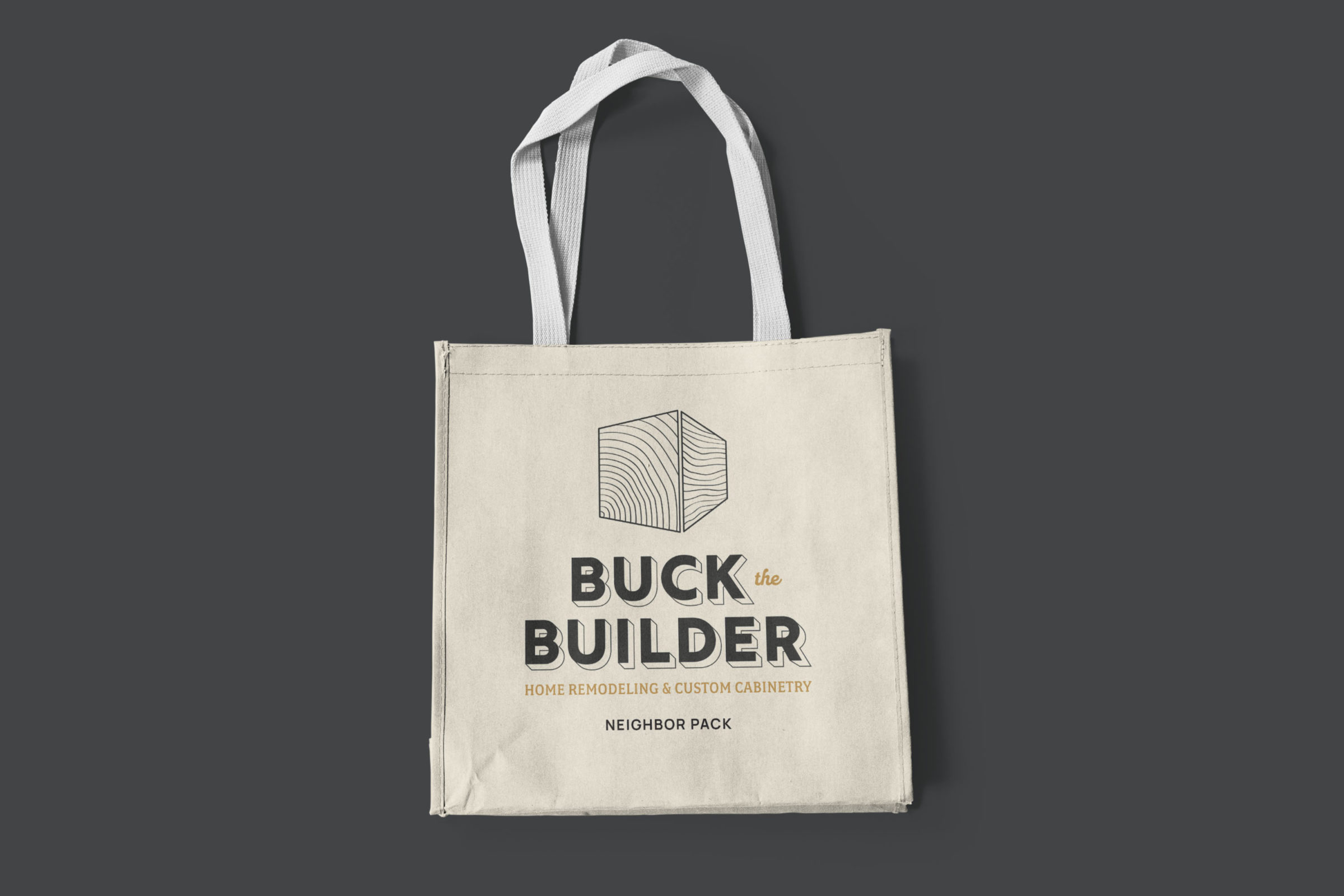
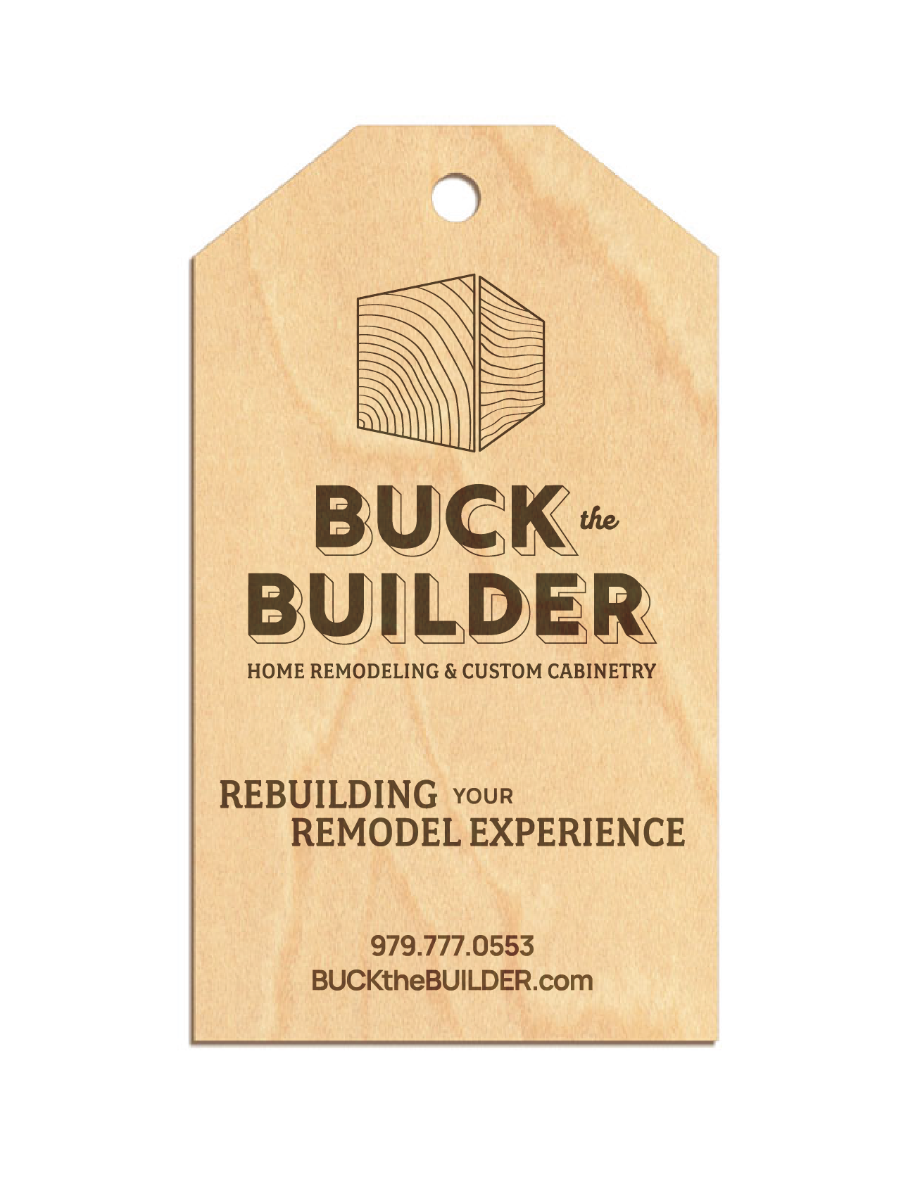
We knew we were going to use an extruded text for his logo lettering – it feels solid, classic, and easily pairs with Buck’s penchant for craftsmanship. It feels ‘built.’ Buck the Builder is already a whimsical name. We were concerned about how ‘childish’ the name might present; we decided to place ‘the’ in a much smaller script font so any signage, truck graphics, etc. would read Buck Builder at a fast glance. As such, the icon is intentionally ambiguous. The corner view of a wood beam, intersecting plywood sheets with grains in view, or perhaps Buck’s thumbprint? His personal touch does impact every design project. The joinery nods to his custom cabinetry – one of his defining products. He builds a much higher quality cabinet than typically found in kitchens and bathrooms. His icon also has a ‘hand-drawn’ or ‘sketch’ feel because the company has always had a hand-sketch element to layouts (and the old logo). We wanted to honor that.
the result:
Here are some of the brand elements Buck chose as we worked through the highly-collaborative process. His launched this look in September of 2020.
Do you need help
talking to your
perfect clients?